~ 3 min read
How To Use Styled Components In React — Beginner’s Guide

Styles Components are an easy and fast way to define styling for your React application. When defining styling with Styles Components you’re actually creating small React components which has the styling attached to it. You can then use this Styled Component for generating the styled output of your other components. Styled Components are easy to learn and easy to implement. This article gives you a quick introduction into Styled Components in React.
Step 1: Setup React Project
In order to be able to work with styled components we need a React project first. Let’s create a new React project in folder styled-components-test with the following command:
$ npx create-react-app styled-components-testHaving created the project successfully you need to change into the newly created project folder:
$ cd styled-components-testStep 2: Install Styled Components Package
Now we’re ready to install the styled-components package by using the Node.js package manager command NPM in the following way:
$ npm install --save styled-componentsLet’s open src/App.js and first get rid of the default implementation of App component and instead start with the following very simple component implementation:
import './App.css';

function App() {
  return (
    <div className="App">

    </div>
  );
}

export default App;
In order to be able to make use of styled components add the following import statement on top of App.js:
import styled from ‘styled-components’Next let’s add the definition of two styled components to the file:
const Title = styled.h1`
  font-size: 50px;
  font-weight: 400;
`
const Header = styled.header`
  background-color: lightblue;
  padding: 20px;
`
Step 4: Using Styled Components
Finally the two defined styled components Title and Header can be used within the JSX code of App component in the same way as other components can be used:
import './App.css';
import styled from 'styled-components'

const Title = styled.h1`
  font-size: 50px;
  font-weight: 400;
`
const Header = styled.header`
  background-color: lightblue;
  padding: 20px;
`

function App() {
  return (
    <div className="App">
        <Header>
          <div>
            <Title>React Styled Components Test</Title>
            <h2>Styling your React app easily </h2>
            <p>Styles Components are an easy and fast way to define styling for your React application. When defining styling with Styles Components you're actually creating small React components which has the styling attached to it.</p>
          </div>
        </Header>
    </div>
  );
}

export default App;
Starting the development web server with
$ npm startshould then give you the following result in the browser:
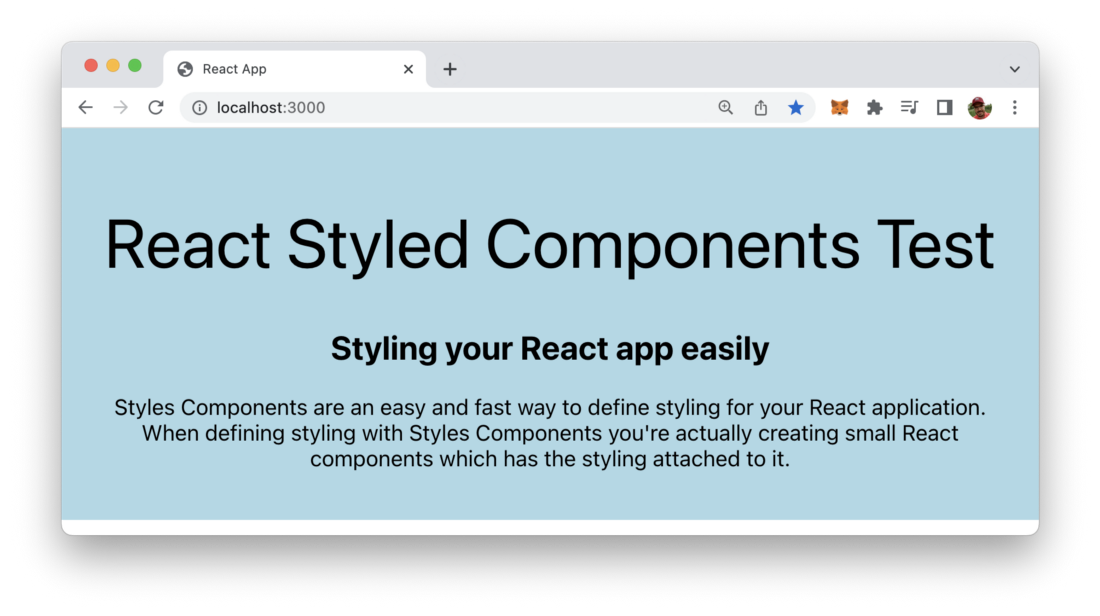
That’s how easy it is to apply styling to your React application by using styled components.